One tree
 One life


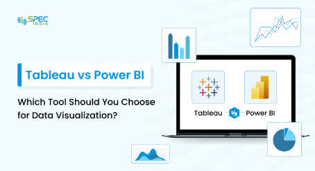
Tableau is considered one of the top techs for data visualization and business intelligence. It provides advanced features that help users extract meaningful insights from data to make informed decisions.
Discover tips, tricks, and strategies with these essential Tableau features, which can help you gain deeper insights into your data. Simplified data means effective decision-making.
Tableau is one of the most popular tools for data analysis and creating interactive dashboards based on data. It allows organizations to create insights from large volumes of data by collecting it from various sources, offering the data in the form of charts, graphs, and maps, and making it easier for the organization to analyze the data trends and patterns.
Because of its user-friendly interface and high functionality, Tableau has many fans among data analysts, business intelligence specialists, managers, and various organizations looking for effective instruments to get the most out of their data.
Have you ever wondered what Tableau is used for and what features make it different from other technologies? Tableau is primarily used for data visualization and business intelligence purposes. Let’s discuss some of the features that can help you create expectational dashboards.
Accelerators are pre-built dashboards designed to speed up the time to insight. These templates cover various industries and use cases, allowing users to quickly customize and deploy visualizations without starting from scratch. It lets you discover more about your data. Plus, you can make accelerators even better by adding your own data and working with partners who offer solutions.
The Analytics Pane in Tableau provides quick access to various analytical tools, such as trend lines, reference lines, and forecasts.
Bins in Tableau allow you to group data points into discrete intervals and simplify your data analysis process. It gives you options to visualize and analyze data with the help of histograms and other data charts. By creating bins, you can easily analyze data distributions and identify patterns. It helps you draw actionable insights from your data.
Think of Tableau Bridge as a translator that sits inside your company’s network. You install it on a computer within your network, and it creates a secure, encrypted connection to Tableau Cloud. This connection allows Tableau Cloud to access and update the data stored on your internal servers, just as if the data were in the cloud.
Boosts data trust and visibility. It also lets you discover your data efficiently. The Tableau Catalog is like a library for all your data assets. It gives you a complete view of your data sources, ensuring you can find and trust the data you need.
It also helps you understand data origins and includes features like lineage, impact analysis, data dictionary, and data quality alerts. Imagine quickly locating the right dataset for your report without sifting through countless files. This is what its catalog features can be used for.
Chart development in Tableau has benefits. Notably, it enhances the experience of data visualization and improves analysis. Tableau enables users to create specialized visualizations. The tool lets complex data come alive.
It does so in impactful, meaningful ways. Tableau is flexible, so it easily uncovers specific trends and patterns. It also identifies outliers that standard charts might overlook.
Data Stories turn your data into easy-to-understand narratives. Instead of just showing charts, Tableau can generate a story that explains the insights. For example, a sales chart might come with a story highlighting key trends, like a spike in sales during the holiday season.
It was specifically designed for business users to help them simplify their data so that they can make insightful decisions at the right time. Data Stories offers an ideal solution for streamlining workflows and unlocking valuable insights from data.
Now, if someone asks you what Tableau is good for? You can directly say data analysis. Explain Data helps you discover the “why” behind your data. It is one of the most important tableau features that one should know. This feature explains outliers and trends by analyzing various factors and relationships within your data, enabling you to make data-driven decisions confidently.
It analyzes various factors and relationships to provide AI-driven, easy-to-understand explanations. For instance, if sales suddenly drop, Explain Data might show that it coincides with a product recall.
Einstein Discovery is a key AI technology within Salesforce. It automatically identifies significant patterns in your data and generates predictive models that reveal key insights. These models help organizations predict customer behavior, such as purchase likelihood or product return rates.
Therefore, with the introduction of integrated Einstein Discovery in Tableau, users can learn about the past with trend analysis and the future with predictions. Nevertheless, using Einstein Discovery, you will get an integrated solution through Tableau dashboards, calculations, and Prep Builder for many important use cases, and it will help people in your organization make the right decision much quicker.
Organizational use of Tableau involves incorporating view into a web page, thereby making the data dashboards more accessible on the web. Make your dashboard Tableau Server, Public or Online, and get the embedding link in the <iframe> tag of HTML; you can integrate your views into your website.
This is one of the biggest Tableau benefits that you can avail of. Tableau’s forecasting features help you predict future trends based on historical data. With forecasting and predictive modeling, you can forecast the next quarter’s sales and prepare your strategies accordingly. By using native predictive modeling, you can create models that look at how your data follows trends in your visuals.
Analysts can use these tools in calculations to find deeper insights. Plus, exponential smoothing helps you predict data with dates accurately. Predictive modeling goes a step further, allowing you to anticipate outcomes to make proactive decisions.
Geospatial Analytics lets you analyze data in a geographical context. You can create maps to visualize where your customers are located or how sales vary by region. You can explore data more deeply and uncover new insights with geo hierarchies. Spatial joins help show how different data relate in terms of location.
Tableau lets you define custom areas and combine data with demographic details, giving you a complete view of your data. For example, a heat map can show areas with the highest sales density.
Hyper is Tableau’s super-fast data engine. It allows you to handle large datasets and complex calculations quickly by analyzing analytical queries in a transactional database. It effectively manages load time and ensures fast data processing, ultimately enhancing dashboard performance. Imagine working with millions of rows of data without experiencing slowdowns—Hyper makes it possible.
Image Role lets you add images to your visualizations. This can make your dashboards more informative and engaging. This feature replaces complex product names or item codes with visual representations, which enhances user understanding and engagement.
Additionally, because these images are stored externally, they incur minimal storage costs and help keep the overall size of workbooks manageable. For example, a product catalog dashboard can include images of each product, which can help users quickly identify items.
The Join Step in Tableau Prep makes it easier to blend data derived from several sources. Sales data could be stored in one file, and customer data could be stored in another file. Merging these files provides a fused result. This drag-and-drop icon makes data preparation much easier.
In short, this approach allows you to integrate pertinent information from sources, making it possible to achieve a holistic understanding of crafting detailed reports. As you set up data source points or alter data in your database, you can track those results.
The Keep Only feature allows users to filter out all the other data and focus their attention only on a particular cell with a mouse click. For example, imagine that you are interested in a particular category of products. You’ll just set the desired category and choose “Keep Only,” and all the other articles will be excluded.
This service enables you to filter the data in each way so that you can easily find specific parts that you want to analyze and that show the data patterns you are interested in. This aids you in focusing on areas of interest that you may wish to explore in more detail.
With Tableau, LOD expressions are like secret superhero tools that can be utilized when analyzing data. IDs are better as they allow Tableau to do the calculations at the database level rather than pulling all this data into Tableau to crunch numbers.
Let’s assume you have a large amount of data, and this array contains such specifics as daily sales numbers, but you need monthly average sales. LOD expressions enable you to calculate this average without bringing all the daily sales data into your visualization. What is particularly amazing about Tableau is that you can specify how granular or how aggregated you want your calculated fields to be. Tableau will take care of it for you.
Flexibility in dashboard design also applies to the possibility of creating dashboard interfaces where different parts of a particular section display a different level of detail.
The Metadata API provides programmatic access to Tableau’s metadata. This means you can automate tasks like updating data sources or managing permissions. The Metadata API lets you explore all the data and details used across your organization. It helps you understand how changes in one part of your data affect other work areas.
Moreover, it allows you to establish strong connections with Alation and Collibra, tools meant for proper organization and efficient data management.
The Metadata API can do it for you if you need to update multiple reports with a new data source — helping you see the relationship between different parts of your work.
If you have not already started using Tableau, let me introduce you to a most used feature called Nested Projects. Nested Projects not only enable the organization of your Tableau content but also facilitate the administration of user access. Through this feature, you can create hierarchical structures. This means that you can split your content into different segments, which greatly eases control over visibility.
It is possible to provide individual-specific access to certain content among different departments, teams, or even individuals. This is an efficient way of managing permissions, as it allows project leaders to oversee those who can access content within their jurisdiction.
Consider this scenario
You could have distinct initiatives for various divisions, each customized with unique entry points. These entry points can be controlled via projects nested within each other, and the access levels for the different departments can be managed through these nested projects.
The ODBC Connector in Tableau enables connections to databases like SQL Server and Oracle. Installing the ODBC driver for your database allows you to effortlessly import data into Tableau for analysis and visualization. Through the ODBC Connector, Leveraging Tableau capabilities with data from sources becomes a straightforward process.
Tableau Prep Conductor helps you see how your data flows and lets you change existing workflows. It’s part of the Tableau platform, so it uses the server’s strong processing ability, manages who can access what, and keeps everything secure. This is really useful for analysts and data managers who need to handle data effectively and securely.
Imagine you need to clean and update your data daily – Prep Conductor can schedule and manage these tasks for you, ensuring your data is always ready for analysis.
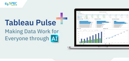
The Tableau Pulse dashboard provides each worker with a detailed view of day-to-day data, which helps them make the right decisions and increases the organization’s revenues.
It aims to make daily operations easier for businesses that rely on data. Providing a new way to look at analytics gives employees smart and relevant insights right where they work. With Tableau Pulse, users don’t need to learn new tools or spend time figuring out how to use them. The best part of Tableau Pulse is that it shows how and what the data says and why the data is important.
Parameter actions modify a parameter’s value directly using interactive visualizations such as mark click or selection. These actions can be used with reference lines, calculations, filters, and SQL queries and can customize the data in your visualization. Parameter actions are necessary because they open new opportunities regarding the creation of summary values and statistics without calculations.
Quality Warnings provide automated alerts on all your data assets. This feature helps you maintain data quality by notifying you of issues such as stale data, broken connections, or other anomalies, ensuring your analyses are based on reliable data.
Use the Resource Monitoring Tool to keep an eye on the performance of your Tableau environment. It provides insights into server health and resource usage so you can ensure Tableau Server is running smoothly and efficiently.
It collects data and creates detailed reports on current conditions. With RMT, you can easily identify reasons for slow loading, extraction failures, and other issues affecting your server’s performance.
By connecting the top analytics platform with the leading productivity platform, you’ll never wait for reports or dashboards again. By linking Tableau with Slack, you can easily exchange insights, receive updates, and collaborate on Data-driven choices directly in your Slack workspace.
Team members can effortlessly share Tableau dashboards, visuals, and insights via Slack. They can also have conversations. Make well-informed decisions at the appropriate moment. This approach enhances the decision-making process for all individuals within your organization.
Table Extensions allows you to bring advanced analytics and predictions into Tableau. You can use external data science models to enhance your analyses. With Table Extensions in Tableau, you can supercharge your data analysis.
Integrating tools like Python, R, and Einstein Discovery allows you to easily enhance and transform your data. This allows you to uncover valuable insights quickly, making your business decisions smarter and faster.
For example, you can integrate a machine learning model to predict customer churn rates and visualize the results in Tableau.
Unified Tooltip provides more detailed information when you hover over data points in your visualizations. This added context helps users understand the data better without cluttering the view.
Additionally, this feature offers error message context directly from tooltips and shows applied filters across worksheets. It’s available for all pill types on shelves, enhancing versatility and utility.
VizQL, Tableau’s proprietary visual query language, ingeniously transmutes your actions into database queries. As you maneuver data fields through drag-and-drop, VizQL promptly fabricates queries to retrieve the results, rendering data interaction intuitive and expeditious.
The Workbook Optimizer facilitates the seamless implementation of performance best practices. This feature scrutinizes your workbooks and offers recommendations to optimize performance, ensuring your dashboards are swift and responsive. It amalgamates insights from Tableau savants and the community, all within the platform, negating the need to switch tools.
There are several ways to incorporate web pages into Tableau, as it can enhance the interactivity and performance of your dashboards. Tableau has different ways of bringing web pages into visualization with the help of Web Page objects and URL actions. The Web Page object lets you build a web page right into your Tableau dashboard; URL actions can generate interactive links to web pages in external applications or in the Web Page object. There are many advantages if web pages are brought into the Tableau dashboard as it provides the users with more related information, engaging content that enables dynamic linking, and the ability to engage the users on different levels.
The Tableau Exchange amplifies your Tableau Platform by provisioning a marketplace for add-ons and extensions. This feature empowers you to augment your Tableau environment with third-party tools, templates, and connectors, broadening its capabilities.
With a solitary click, you can effortlessly navigate, search, sort, and filter through a diverse array of offerings tailored to your specific needs. This adaptable platform enables you to leverage ready-made solutions for various data categories, enhancing the value of your analytics investment.
The Year Over Year Growth feature lets you quickly answer common questions about performance changes over time. With just a few clicks, you can compare metrics year-over-year, providing valuable insights into trends and growth.
Zoom and Pan Controls in Tableau customize how people interact with data. Zoom controls let you zoom in on specific information or out for a broader view, while pan controls allow you to move around the visualization. Tableau’s interactive capabilities improve data analysis by allowing you to examine individual data points, patterns, and insights easily.
Mastering these salient Tableau features equips you with a comprehensive toolkit for transforming data into meaningful insights. Whether you’re exploring advanced analytics, enhancing visualization techniques, or streamlining data governance, Tableau offers versatile solutions to meet diverse business needs.
By harnessing these capabilities, you can empower your organization to make data-driven decisions confidently and drive innovation in your data strategy.
Tableau Desktop is highly recommended for advanced visualizations within this price range.
Tableau features include interactive dashboards, data blending, real-time analytics, and advanced mapping capabilities.
Tableau's unique feature is its intuitive drag-and-drop interface that simplifies complex data visualizations without requiring extensive programming skills.
Tableau benefits include enhanced data visualization, faster insights, improved decision-making, and simplified data sharing across organizations.
Tableau products include Tableau Desktop (for individual users), Tableau Server (for sharing visualizations across organizations), and Tableau Online (cloud-based platform for collaborative data analysis).
SPEC INDIA, as your single stop IT partner has been successfully implementing a bouquet of diverse solutions and services all over the globe, proving its mettle as an ISO 9001:2015 certified IT solutions organization. With efficient project management practices, international standards to comply, flexible engagement models and superior infrastructure, SPEC INDIA is a customer’s delight. Our skilled technical resources are apt at putting thoughts in a perspective by offering value-added reads for all.
“SPEC House”, Parth Complex, Near Swastik Cross Roads, Navarangpura, Ahmedabad 380009, INDIA.
“SPEC Partner”, 350 Grove Street, Bridgewater, NJ 08807, United States.
This website uses cookies to ensure you get the best experience on our website. Learn more