

11 Best Practices for Tableau Dashboard Design
Tableau is a notable tool in data visualization that helps users design and enable them to develop meaningful and engaging dashboards. However, creating outstanding Tableau dashboards goes beyond just the graphic interface of the dashboards, where features are dragged and dropped on a surface.
When a dashboard is designed properly, it is almost impossible to imagine working without it. Why? Because it is the starting point for obtaining meaningful information for all your systems. It requires design thinking approaches, experiences, and effective data presentation methods. Your IT team can quickly make decisions based on some of the data pulled from your ticketing, budgeting, or monitoring systems.
Below, you will find eleven tips detailing designing a powerful and engaging Tableau dashboard.
11 Proven Strategies for Creating Impactful Tableau Dashboards
In Tableau, some guidelines should be followed when designing dashboards to make them accessible and understandable to all users. When used as a working set, these principles allow you to create practical and aesthetically pleasing dashboards where all the required information is conveniently presented in a single view.
However, before going ahead with the design, it is very important to decide on the need for the dashboard.
- What questions should it address?
- To whom is this product targeted?
Knowledge of these aspects will help you make appropriate design choices for your work, thus providing the intended audience with the right dashboard.

Here are 11 Best Practices for Tableau Dashboard Design to consider in 2024.
- Know your audience
- Consider display size
- Incorporate fast-loading plan / Work to reduce page loading time
- Leverage the sweet spot
- Avoid having too many views and colors.
- Incorporate Interactive Features
- Master Tableau’s Three Navigation Types
- Leverage tooltips, the story within your story
- Format from Largest to Smallest
- Simplify and embrace minimalism, Prioritize minimalism
- Test your dashboard
When designing a Tableau dashboard, it’s crucial to follow a systematic approach to ensure it effectively communicates data insights and facilitates informed decision-making. Here’s a step-by-step dashboard design best practices to consider in 2024.
1. Know Your Audience
Understanding your audience is the cornerstone of effective dashboard design. When you create a dashboard, have a clear goal in mind. Don’t just combine your charts and graphs; I hope it makes sense. Think about what you want to achieve. Start with a big-picture overview and let your users click for more details. Too much information crammed into one place can overwhelm and frustrate your users.
To see if your dashboard works well, use the five-second rule.
When you share your dashboard with someone, and if this person understands what you want to explain in that dashboard within 5 to 30 seconds, then you are on the right track.
Here is the important advice – Stick to essentials, Number Two: Make it uncomplicated, and Number Three: Do not lose sight of your purpose
2. Consider Display Size
Ensure that your dashboard is responsive and looks perfect on all screen sizes. Ideally, it should look nice across a large desktop monitor, a tablet, and a phone, and the change between these resolutions should be seamless. In this way, all users get the best experience using the application when it is opened on any device.
For instance, if you develop a dashboard for a computer screen, most of your audience may access it with mobile devices. They won’t be happy! Understanding your users’ preferred devices to optimize your dashboard is important.
To learn more about designing dashboards for different devices, check out the Dashboard Device Layouts in Tableau.
3. Plan for Fast Load Times
When we attempt to open a website, and the page seems to be loading for a long time, we close that tab and open another site. The same can also be said for loading the dashboard or loading any other graphical user interface component of a web page.
Regarding the tableau dashboard design aspect, the loading speed of the dashboard must be considered. Nobody likes to wait while a dashboard is loading. There are several reasons why the page’s loading can be slow, including the large amount of data used in the development of the page and complex graphics.
Here’s a tip
The most important choices you make as a dashboard creator start before you build anything—in the data preparation phase. Spend some time getting to know your data. heck out the “Know Your Data at the Database Level” and “Test Your Data and Use Extracts” sections in the Tableau Help.
4. Leverage the Sweet Spot
A Creative tableau dashboard design requires a thorough understanding of how you target your customers and what experience you provide them through your dashboard. Think of your dashboard like a storybook. The main message should be front and center, just like the most important part of a story. This central area is called the “sweet spot” because it’s where people look first.
For example, assume that you are developing a sales dashboard. This is where the total sales figure and the names of the most popular products should be placed. Placing these key metrics here will allow your users to immediately see all necessary information without looking for it.
Using the sweet spot effectively helps your audience understand the main insights immediately, making your dashboard more engaging and easier to use.
Tip – Avoid repeating information on Tableau dashboards to maintain clarity and prevent confusion for viewers
5. Know The Color Types in Tableau and How They Are Used
Avoid overwhelming users with too many different views or colors on your dashboard. Keep the design clean and focused by using a limited color palette and displaying only essential visualizations that support your dashboard’s objectives.
It is advised to Limit the Use of color to one Primary Color Scheme
Using too much color on a dashboard can be overwhelming. Try to limit the use of color to highlight just one dimension or one measure. If you need to add another color, make sure it’s a muted shade so it doesn’t clash with the main color.
Apart from this, Ensure that each set of data is represented distinctly. Avoid using the same color for two different data.
To make your website more attractive, use a bright color for the number of visitors, such as blue. You can also show the bounce rate, in which case you should use a low-visibility color such as light grey.
That way, the volume of visitors is maintained as primary while the bounce rate is still present, though not dominating the screen.
Also, do not forget that many people see colors differently—color blindness, for example, affects up to 10% of men and 1% of women, according to the information provided by an expert, Stephen Few. The first one poses difficulty distinguishing between the colors red and green.
Therefore, to target color-blind people, avoid using red-green colors because they are hard to distinguish; instead, opt for grayscale or blue-orange colors.
If your dashboard will be viewed by many people, consider color blindness. You might even create specific dashboards for color-blind users to ensure everyone can easily understand your data.
6. Incorporate Interactive Features
The idea of dashboards becomes extremely powerful when the users can work with the data represented on the screen. Improve the user experience by including features like filters, drill down, and toots. Such features enable users to interact with data more actively and find information they are looking for or interested in.
7. Master Tableau’s Three Navigation Types
Today, Modern Tableau dashboard design requires a deep understanding of these three navigation types. This is one of the major practices that you should consider.
Imagine you have a dashboard showing sales performance by region. With select navigation, you can set it up so users can click on a specific region to see more detailed information, like sales by product or customer feedback for that region. It’s like zooming in on a map to get a closer look.
Hover navigation is slightly different from the traditional navigation system. Instead of selecting something by clicking on it, you hover your cursor over an item, and it will work. For example, a mouse pointer hovering over a sales bar may reveal the summary of the sales made in that given month without clicking. It is useful for gaining a brief insight into information without clicking through to the full page.
Menu navigation also offers options now. It’s like choosing what you want next from a restaurant menu. For example, in a dashboard that displays customer feedback in various areas, a submenu may appear when the area is clicked, and the user will be able to choose whether to view more detailed statistics for the selected area or switch to another dashboard completely.
These navigation tools enhance the functionality of a dashboard and make it easy to use. They enable individuals to gain unique insights tailored to their needs, ranging from a broad perspective to detailed information. Mastering these techniques enhances usability and takes the data stories to another level.
8. Leverage Tooltips, the Story Within Your Story
Use tooltips appropriately to give elaborative information about the data in the dashboard without filling the entire screen with excess information. Tooltips are used as an additional layer of information that provides users with necessary insights and assists in understanding the story and the data behind it.
9. Format from Largest to Smallest
When formatting your work, follow a “largest to smallest” approach for efficiency and to avoid accidental changes. In a dashboard, the formatting hierarchy –
- Starts with the theme,
- Then moves to the workbook, worksheet, and
- Finally, individual view parts.
Start by picking the right theme from the available ones, including Tableau’s newest default theme from Format > Workbook Theme.
Secondly, work at the workbook level to ensure proper formatting for the entire workbook, including the fonts and titles used in each project.
After that, refine formatting at the worksheet level. Lastly, individual parts of each view are addressed to fine-tune details.
To improve dashboard readability, eliminate non-essential features, and use the space around visualizations wisely. Cluttering reduces the overall readability of content and makes it difficult for a user to understand the page’s contents quickly.
10. Eliminate Clutter and Prioritize Clarity
Remove unnecessary distractions and focus on simplicity. Minimize the clutter and keep it clean by eliminating all the non-essential components of the browser. Here, the author needs to arrange the paper so that the important information stands out and the text is not cluttered. Proper labeling and uncluttered design enhance the reader’s understanding of a text.
11. Test Your Dashboard
Now, it’s time to test your dashboard. When you are done creating a Tableau dashboard, ensure you check its functionality a few times. Conduct surveys and interviews to collect feedback from the target groups of people that will use the dashboard and understand whether it is functional across the devices it is supposed to cover and whether it achieves its main goal satisfactorily.
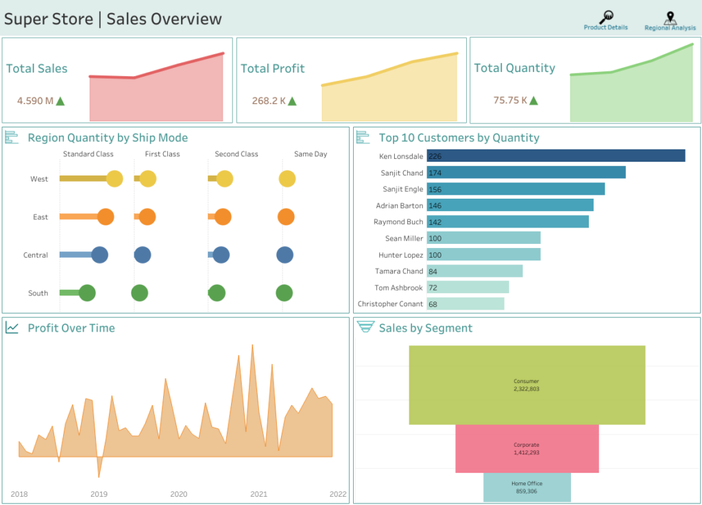
Have a look at one of our Modern Tableau dashboard designs that we have done for one of our clients = Tableau Superstore Dashboard.
Final Tips
Several crucial principles can be listed when designing Tableau dashboards, improving their usability and functionality and making them beautiful and appealing. In this blog, we have discussed essential practices such as keeping the dashboard design simple, ensuring the integrity and accuracy of data, optimizing dashboard performance, and selecting the right visualizations.
As you embark on creating your Tableau dashboards, remember these tips:
- Simplicity is key: Design your interface to be as simple as possible to enhance the likelihood of understanding.
- Focus on data quality: Regularly sanitize your data sources to reduce inaccurate or misleading visualization cases.
- Optimize performance: Consider how certain decisions you made when constructing the dashboard may affect its performance, such as using extracts rather than live connections in some situations.
- Choose the right visualizations: Choose the most appropriate Power BI visuals for your analytical data that are useful to the audience.
These best practices can help you add value to your Tableau dashboard design process and ensure that your dashboards deliver relevant insights to decision-makers.
Looking to design an interactive Tableau dashboard? Contact us for professional Tableau consulting services.
Frequently Asked Questions
Tableau Dashboard Design involves the ability to create the visual and the interactive dashboards using the Tableau tool. The design aims at enabling users to easily comprehend as well as use data for their advantage.
The best practices aim at making your dashboards interesting, effective and fast. It is for the purpose of improving the performance, end users satisfaction and to make sure that the message which the dashboards are conveying is relevant.
Some of the pitfalls are grouped under the following categories; poor visualization, poor design of the dashboard, lack of consideration of user needs and poor optimization. The emphasis should be made on ease, readability and following the principles of user-oriented design.
Some of the ways in which the performance can be enhanced include simplifying or eliminating formulas, limiting the use of graphics, using extracts instead of live data, and also optimizing the filters and data sources.
User experience has a significant role in Tableau Dashboard Design as it defines how easy it is for users to navigate and comprehend the content represented in the dashboard. Good UX makes certain that the dashboard is very well optimized and user friendly, as it should be.
Interactivity can be enriched by filters, action, tooltips and parameters, including, for instance, drill-downs and highlighting. These features enable users to penetrate the data and get better understanding without having the impression of being loaded with information.
Some guidelines are maintaining maximum consistency as to the choice of colors, avoiding too bright and contrasting colors and using color as the way to emphasize certain data. Appropriate color combinations should also be chosen that are good for people with color blindness.
For a dashboard that will be accessed on both computers and mobile devices, use the responsive layout, keep your visuals simple, and make the buttons and filters big enough to be easily selected on a smaller screen. There are specific mobile layout options that are available for use in Tableau and that can be used for this purpose.
Frequency of updates of the database depends with the nature of the data and the frequency of usage among the users. For the data that are current or changes very frequently, the dashboards probably will have to be updated on a daily basis or even in real time. Static data may require only moderate changes not very often therefore less frequent updates of such data.
Advanced features include using calculated fields, level of detail (LOD) expressions, parameter actions, custom geocoding, and Tableau's integration with other tools like R and Python for more complex data analysis.
Yes, Tableau dashboards can be shared with others through Tableau Server, Tableau Online, or by exporting them as PDFs or images. You can also embed dashboards into websites or share them via a link.
SPEC INDIA is your trusted partner for AI-driven software solutions, with proven expertise in digital transformation and innovative technology services. We deliver secure, reliable, and high-quality IT solutions to clients worldwide. As an ISO/IEC 27001:2022 certified company, we follow the highest standards for data security and quality. Our team applies proven project management methods, flexible engagement models, and modern infrastructure to deliver outstanding results. With skilled professionals and years of experience, we turn ideas into impactful solutions that drive business growth.
Table of contents
- 11 Proven Strategies for Creating Impactful Tableau Dashboards
- Know Your Audience
- Consider Display Size
- Plan for Fast Load Times
- Leverage the Sweet Spot
- Know The Color Types in Tableau and How They Are Used
- Incorporate Interactive Features
- Master Tableau's Three Navigation Types
- Leverage Tooltips, the Story Within Your Story
- Format from largest to smallest
- Eliminate Clutter and Prioritize Clarity
- Test Your Dashboard
- Final Tips
Delivering Digital Outcomes To Accelerate Growth
Let’s TalkTable of contents
- 11 Proven Strategies for Creating Impactful Tableau Dashboards
- Know Your Audience
- Consider Display Size
- Plan for Fast Load Times
- Leverage the Sweet Spot
- Know The Color Types in Tableau and How They Are Used
- Incorporate Interactive Features
- Master Tableau's Three Navigation Types
- Leverage Tooltips, the Story Within Your Story
- Format from largest to smallest
- Eliminate Clutter and Prioritize Clarity
- Test Your Dashboard
- Final Tips
Delivering Digital Outcomes To Accelerate Growth
Let’s Talk


Let’s get in touch!
India
SPEC House, Parth Complex, Near Swastik Cross Roads, Navarangpura, Ahmedabad 380009, INDIA.
-
 +91-79-26404031, 32-33-34
 -
 [email protected]
