


Did you know that over 58% of global website traffic now comes from mobile devices?
Yet, many websites still fail to provide a seamless experience across different screen sizes. A frustrating layout, unreadable text, or misaligned buttons can drive users away, leading to higher bounce rates and lost conversions.
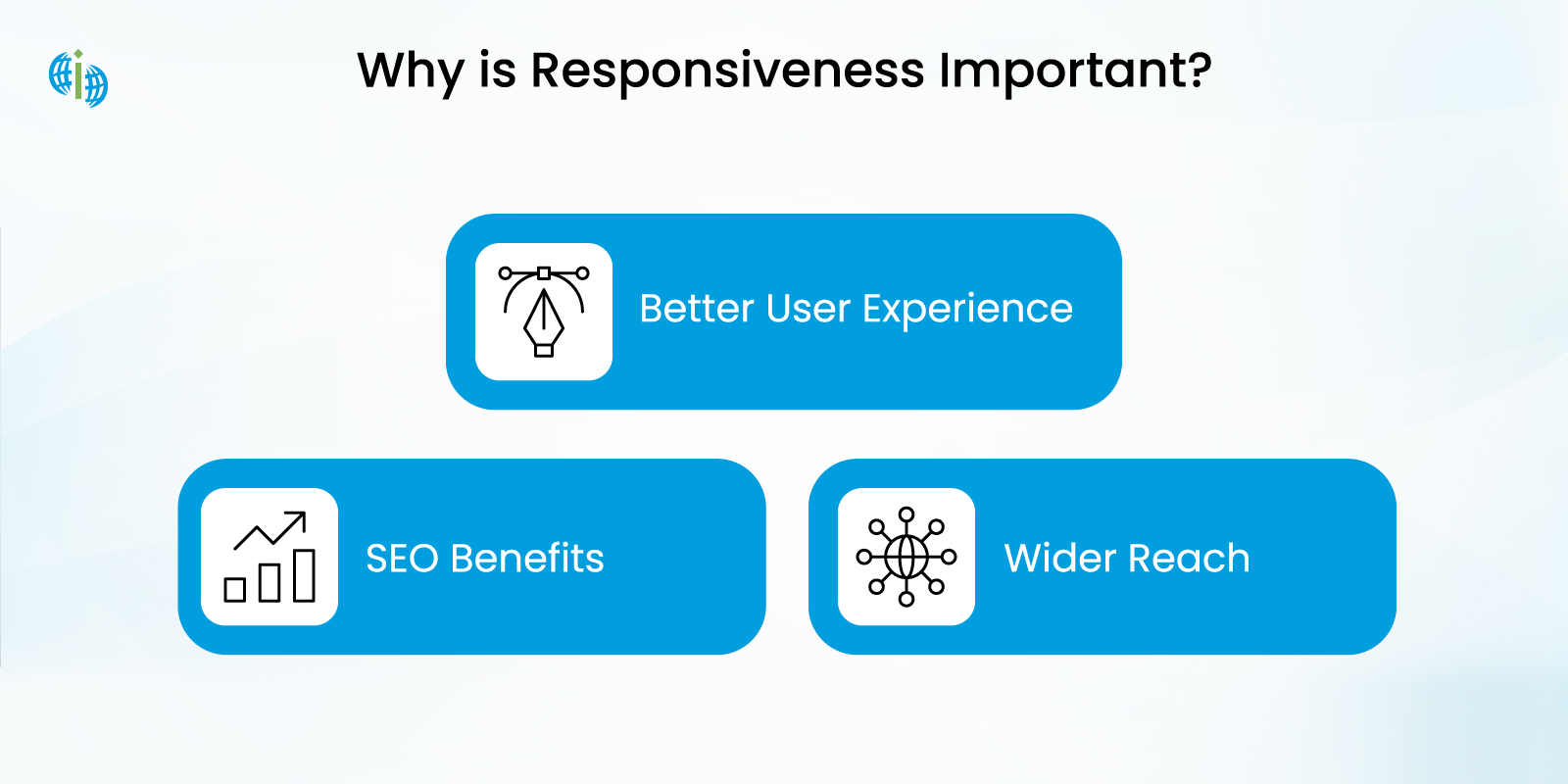
Web application users expect seamless adaptations in the present digital environment regardless of their choice between desktop platforms or mobile devices. Web development must integrate responsive design since it constitutes a basic requirement to achieve better user retention while raising accessibility and search results rankings.
The most popular JavaScript library called ReactJS enables this functionality. Components in ReactJS provide adaptability while the ability to manage state effectively and optimized rendering capabilities suit development of high-performance dynamic web applications. This guide provides clear explanations about developing an entire responsive web application with ReactJS through multiple system-based methods.
Our guide will teach you all the techniques and integration strategies for media queries with flexbox as well as Material-UI and Styled Components to build web applications with a flawless touchscreen experience.
Web applications today benefit from Responsive Web Design (RWD) since it enables websites to scale according to screen sizes and device features automatically. Users accessing websites by any device will experience optimized viewing because responsive design automatically adjusts the layout.
A responsive web application:
Responsive web design (RWD) ensures that websites provide an optimal viewing experience across different devices, screen sizes, and resolutions. To achieve this, developers rely on several key technologies and techniques.
1. HTML5 (HyperText Markup Language 5)To install Bootstrap in React:
HTML5 forms the foundation of responsive web design. It provides semantic elements like <header>, <article>, and <section> that help structure content more effectively. Additionally, HTML5 supports multimedia elements (<video>, <audio>), making it easier to build interactive and mobile-friendly websites without relying on external plugins.
2. CSS3 (Cascading Style Sheets 3) and Media Queries
CSS3 plays a crucial role in defining the visual presentation of a website. One of its most important features for responsive design is media queries. Media queries allow developers to apply different styles based on screen width, resolution, or device type. For example:
This ensures that elements adjust dynamically based on the user’s screen size.
//@media screen and (max-width: 768px) {body {font-size: 16px;}}3. Flexible Grid Layouts and CSS Grid/Flexbox
Instead of using fixed pixel-based layouts, modern responsive web design relies on fluid grids that use relative units like percentages (%) or viewport width (vw).
4. JavaScript and Responsive Frameworks
JavaScript enhances responsiveness by dynamically adjusting elements, handling touch gestures, and enabling interactive content. Libraries like jQuery simplify responsive UI interactions.
Additionally, frameworks like:
help streamline responsive web development.
5. Responsive Images and SVGs
Using scalable and adaptive images ensures that visuals look sharp on all devices. Techniques include:
srcset and sizes attributes in HTML for adaptive images.
SVGs (Scalable Vector Graphics), which scale without losing quality.
CSS background images with background-size: cover; to maintain aspect ratios.
6. Viewport Meta Tag
Setting the viewport correctly ensures proper scaling on mobile devices. Adding this in the section prevents zooming issues:
"meta name="viewport" content="width=device-width, initial-scale=1"A responsive design is no longer optional—it’s essential for a modern, high-performing website. Investing in RWD ensures your site is user-friendly, accessible, and well-optimized for search engines.
Before we dive into responsive design techniques, let’s set up a basic ReactJS project.
1. Install ReactJS
If you haven’t installed React yet, set up a new project using:
Vite for a faster setup:
npm create vite@latest my-react-app --template reactcd my-react-appnpm installnpm run dev2. Organizing the Project Structure
A well-structured project improves maintainability. Here’s a basic structure:
/srcNow that our setup is ready, let’s start making the web app responsive!
Popular CSS Frameworks for Responsive Design
To make development faster, you can use:
To install Bootstrap in React:
npm install react-bootstrap bootstrapThen import it in main.jsx or app.jsx.:
import 'bootstrap/dist/css/bootstrap.min.css'; Step 1: Install
npm install tailwindcss @tailwindcss/viteStep 2: Configure the Vite plugin
Add the @tailwindcss/vite plugin to your Vite configuration.
import { defineConfig } from 'vite' import tailwindcss from '@tailwindcss/vite'export default defineConfig({plugins: [tailwindcss(),],})Step 3: Import Tailwind CSS in your css file
@import "tailwindcss"; Step 4: Example
<div class="col-auto calender-top-icons">
    <button type="button" class="btn btn-info event-filter-wrapper cmn-btn" id="openLeaderFilter">
        <img src="http://127.0.0.1:8000/backend/assets/images/filter.png" alt="Filter by Leader">
        <span id="leaderCountDisplay">Leader</span>
    </button>
</div>
For component-based styling, use:
Example with Styled Components:
npm i styled-componentsimport styled from 'styled-components';const Button = styled.button`background-color: blue;color: white;padding: 10px;border-radius: 5px;@media (max-width: 768px) {background-color: green;}`;Using CSS Grid and Flexbox
CSS Grid and Flexbox help in creating fluid layouts.
Example of a responsive grid:
.container { display: grid; grid-template-columns: repeat(auto-fit, minmax(250px, 1fr)); }For a flexbox-based navbar:
.navbar {display: flex;justify-content: space-between;padding: 20px;}@media (max-width: 768px) {.navbar {flex-direction: column;}}React-Responsive helps in handling breakpoints dynamically.
npm install react-responsiveUsage example:
import { useMediaQuery } from 'react-responsive';const ResponsiveComponent = () => {const isMobile = useMediaQuery({ maxWidth: 768 });return ;
};
Instead of building everything from scratch, use pre-built components:
npm install @mui/material @emotion/react @emotion/styledUsage example (Material-UI Drawer for mobile navigation):
import { Drawer } from '@mui/material'; Menu ItemsLooking for React JS
Creating a Responsive Navbar
For mobile-friendly navigation, use react-router-dom and Material-UI’s Drawer.
Example using React-Bootstrap:
import { Navbar, Nav } from 'react-bootstrap';Brand
Tools for Testing
✔ Chrome DevTools – Resize window test mobile view
✔ BrowserStack – Cross-browser testing
✔ Responsive Design Mode (Firefox Chrome)
1. Code Splitting Lazy Loading
Reduce load time by loading components only when needed.
import { lazy, Suspense } from 'react';
const LazyComponent = lazy(() => import('./LazyComponent'));
Loading...
}
;
2. Optimizing Images Assets
Use WebP format for images
Implement lazy loading using loading=”lazy”
3. Minimize Unnecessary Rerenders
Use React.memo to prevent unnecessary re-renders.
const MemoizedComponent = React.memo(MyComponent); Building a responsive web application with ReactJS helps ensure that users have a smooth experience, no matter what device they use. With so many different screen sizes today—desktops, tablets, and mobile phones—your app should adjust automatically to fit them all.
ReactJS makes this easier with its component-based structure. Using CSS frameworks like Bootstrap or Tailwind CSS can speed up the styling process, while tools like React-Responsive and Material-UI help create layouts that adjust to different screen sizes.
Performance is also important. Techniques like lazy loading and image optimization can help your app load faster and run more smoothly. Before launching your app, testing it on different devices and using browser tools can help catch any layout issues.
SPEC INDIA is your trusted partner for AI-driven software solutions, with proven expertise in digital transformation and innovative technology services. We deliver secure, reliable, and high-quality IT solutions to clients worldwide. As an ISO/IEC 27001:2022 certified company, we follow the highest standards for data security and quality. Our team applies proven project management methods, flexible engagement models, and modern infrastructure to deliver outstanding results. With skilled professionals and years of experience, we turn ideas into impactful solutions that drive business growth.
SPEC House, Parth Complex, Near Swastik Cross Roads, Navarangpura, Ahmedabad 380009, INDIA.
 +91-79-26404031, 32-33-34
  [email protected]

This website uses cookies to ensure you get the best experience on our website. Read Spec India’s Privacy Policy


